Visualizzazione post con etichetta Graduate Diploma Photography. Mostra tutti i post

Last assignment was about Street Fashion Photography. The brief was to simulate to have been commissioned by a publication to illustrate an article on Street Fashion. The theme of the article was that street fashion influences designers and the fashion industry generally and vice versa.
The magazine that could have published the picture was a young magazine such as ID, Dazed and Confused, Wallpaper, Tank or any other edgy magazine.

I went on a Saturday to Oxford street with my Nikon D800 and two lenses: 85mm and 17-35mm. I thought that the wide angle zoom lens could have been useful to get very close to subjects and create an unnatural look to the photo. And this was very true, but I soon realised that my problem was approaching people. So I went for the 85mm that allowed me to take candid shots without asking the subject to pose. It was a try and learn process. After trying different approaches, I found a beautiful background, a shop window full of silver foil balloons. I waited for the right subject to come but the street became packed with people and everyone was running after their own businesses.
I walked, followed interesting people and, at the end of the day, I had a few decent shots in my pocket.


I was not very happy with them but as the temperature was getting very cold, I came back home with a fever. I gave it another go a few days later, trying to stop people but nobody wanted to pose for me, how sad.


Here it is how I cropped and adjusted some of them.


I chose and submitted for the assignment the last one and added a white border.
After the review, Ian and Selina explained more about the 'golden rules' of street fashion photography. Some of them I learned from experience.

- Use long lenses if you want to stay far away from the subject. Wide angles to give an unreal but pleasing look.
- In Street Fashion, it is more important how people wear something than what they are wearing.
- Direct people. If they give us their consent to pose, we have to explain everything and direct them precisely, they will fill more comfortable.
- Try to eliminate everything that is not relevant from the background.
- NO SMILES. Street fashion is more about the subject being confident making the viewer want to be at their place.
- Backlighting is glamourous.
- The importance of context. It is ok to play with contrasts, but the idea has to be clearly exposed.


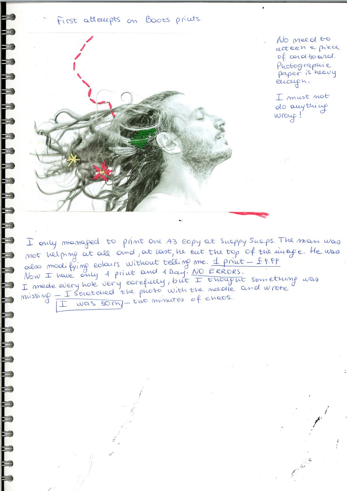

The journey for this assignment has been very long. I started thinking about forgotten memories and how to express them by manipulating the photograph. Having been doing origami for many years, the choice was there. So I experimented with portraits from magazines to try and and figure out something. The idea behind was that how we perceive our lives also depends on how we remember things. Important moments that we remember as well as forgotten memories that lie beneath the surface. The result is a very  odd and new portrait that is not looking exactly as we do in reality but in which we can still recognise ourself.


After trying to find out how to make my final portrait I googled about it and, unfortunately, I found out that a similar work already existed. That was a turning point as I had to decide wether to continue with it anyway or to change direction and start thinking on something else. Time was running out, I only had about 3 days to finish the assignment. 

CHANGING DIRECTION.

With only a few days to go, I thought about working on forgotten memories from a different perspective. This time, I focused on how we sometimes process our memories. It has happened to me to not remember a certain thing or a certain moment, the memory of it suddenly started fading away so I imagined new things about it and, as time passed on, I could not distinguish about reality and invention. Sometimes I can make some memory better or I can simply replace an empty space in my memory with something new. It is a sort of re-shaping my past, to make it better or, at least, feel better.


So I ended up with a portrait, made using a flashgun fired off an umbrella with my daughter holding a silver reflector. Then, I played with shadows and various other settings on Lightroom in order to achieve a very ethereal look. 

THE PRINTING NIGHTMARE.

As the title says, printing this image was a real nightmare. Time was running out and I needed a decent print of my photo in order to be able to embroider on it. Lets say I needed at least two prints. Of course, at UAL you can produce professional high quality prints, but it requires time and I did not have enough. So a technician suggested me to go to a snappy snaps point to have it done quickly. Tuesday morning I went to Ealing Snappy snaps and the guy decided to crop part of the image to fit it in the page. Then I saw him changing the colours. Anyway, for £9.99 I brought home the only print I could afford.
Embroidery was not too difficult (I can sew and do other manual things) but I really felt under pressure because I could not afford to do something wrong as it was my only copy. At last, I managed to finish it, although I am not entirely satisfied with the result and I think I am going to work more on it.


We are now getting into it. After processing our own film, we made our contact sheet. I did it before a couple of times and I enjoy it every time. 
First, Adrian showed us where everything is in LCC darkroom. Then how to set the enlarger in order to prevent any light from spreading around the space ruining all the work.
When the negative was ready in the easel, we tried different exposure times on a piece of sheet of photographic paper, blocking the light by using a black cardboard.

  
1. Exposing the paper doubling the time. We found the correct exposure being between 15 and 30 secs.


2. Giving 5 secs between exposures. We tried a 17.5 sec.


3. After that, we raised the contrast on the enlarger from 2.5 to 3.5 to enhance it.

4. Final contact sheet at 17.5 secs 3.5 contrast.

I learned that in order to have a consistent contact sheet and exposure time I need to be consistent in my exposure when shooting.


Alessandro, Claire and I went to our first Studio session to try and do some practise with studio lights. Studio lighting can be intimidating, at first. The studio is big, the flashlights have many controls and I tried to remember all the safe health and safety rules the technician told us during the studio inductions. So many things can go wrong!
Anyway, we managed to use them quite easily. After trying different light modifiers on one flashlights, just to see the differences, we played with two or more lights. 
Initially, we wanted to recreate a portrait with plain white background so we placed one flashlights each side pointing at the white background. Then we placed the key light and took a light measure. After practicing a bit, we managed to achieve a perfectly white background by adding 1 stop light power to the background flashlights.


We also tried black background (no lights on the background) and adding a soft halo behind Claire's head. 

NOTES
- We suffered very much because it was too warm inside the Studio, I think we left all modelling lights on Max instead of Rel.
- Music is important.


On Sunday 30th October, we went to see this exhibition in Brighton with Selina. We travelled together by train and arrived at Brighton at 1.30 pm.
Unfortunately, we had the time to only see two exhibitions, as they were all closing at 4 pm and it was the last day.
Anyway, the first exhibition was STATE OF CONTROL.
                      

As soon as we walked trough the door, a guy welcomed us and showed the place, an office rearranged for the exhibition. CONTROL consisted of 5 different parts. 

The first one was dedicated to the work of SIMON MENNER, Fake arrest and Hand to hand combat. The images belong to the STASI archives and were meant to be a sort of visual instructions on how to deal with dissidents among the population. 
The pictures are not professionally made, they serve the purpose of literally showing actions to be taken in various situations, like the fake arrest and hand to hand combat.


"Many of these snapshots seem absurd; they may even be amusing. And yet we ought not to loose sight of the intention that led the STASI agents to take them. These photographs document the repressive measures taken by a totalitarian state in order to create terror and fear among the population." (extract from Menner website)


Opposite to Menner's images, we saw RAFAEL MILACH's, The Winners, works. 


The caption said:

"The Winners is dedicated to winners of various state and local competitions held between 2010-2013 and supported by the Belarusian authorities. The list of the winners also includes the best in contests promoting beauty or public space maintenance. Winners are present in kolkhozes, schools, public institutions, nightclubs, village discos and on Boards of Honour in almost each Belarusian town."

These incredible images (about 50) were installed on plywood, not completely attached to it. The viewer had the possibility of guessing what every single image was about and then pulling it up and read the real caption. This part of the exhibition was my favourite. The images were so outstanding and weird! Apparently there was a prize for everyone and for everything.


1. Zhodino. Natalya and Konan, the best couple in love.
2.Volozhin. Arri, the multi-champion in dog beauty contests.
3. Elena, the best milkmaid of the Slutsk region.
4.Natalya, the winner of the contest for the best lookalike of Jennifer Lopez.
5.Asinovshina. Olga, the mother of the best large family in the region of Smorgon.  


In the second room, on one side, we saw JOACHIM SCHMID's work, X MARK THE SPOT.


The images in the series were about tourists taking picture of theirselves on the X marked in the large street were JFK was assassinated. The interesting about this work was how they were taken. A webcam was positioned in a building in the exact position from where the shot went out.

Opposite to Joachim Schmid work, there was SARAH PICKERING, Public Order.


"Riots and scenes of civil unrest are a daily occurrence in a small town called Denton. Despite the heavy police presence the violence is only ever temporarily suppressed. Another day brings more trouble - an incident at the underground station; barricaded streets; an injured civilian to bring to safety.
Denton is a set used by the police, designed to provide a realistic backdrop for a riot. The violent aggressor is defined here by the estate he could inhabit. Although absent from the photographs, his identity can be pieced together from the elements of social stereotyping in this purpose-built environment. The Public Order series of photographs documents the attention to detail and simultaneous lack of realism within this artificial environment. This is a living invention, a fantasy placed within the real world - an attempt to make violence and disorder tangible and knowable."


Another interesting space was the CONFESSIONAL BOOTH. In it, you had the possibility for a session of Portfolio Review.


ANITA STRASSER. Making space more liveable.

Last week, during the Language Development class, Adam gave us a little exercise to do. He brought some booklets of a past exhibition, named FRAMING URBAN NARRATIVES.
At first, we analysed the three single words, trying to figure out what the exhibition could be about. Then, we opened it and watched at the images without reading the descriptions. The exercise consisted of attempting a visual analysis just by watching them. He also gave us a scheme to follow when analysing an image.


This was my attempt


Go to FRAMING URBAN NARRATIVES website


This was the first assignment I worked at. From the workbook scans, my creative and thinking process is more clear.
Basically, I started brainstorming with my family about feelings that the colour RED evoked to us. Some red related feelings, emotions and various things (Alice, my 6 yo daughter, started naming everything she knows is red) came out of it, until the moment in which we considered that my partner is COLOURBLIND.  That was the turning point in my project.
We, as people with normal colour vision, easily link different colours to different feelings in quite the same way. I thought it would have been interesting to study more about how different colour's perception can affect the life of colourblind people. Through photography, of course.


Me and Giorgio thought about giving the project a sense of different visions. I choose to take the same photo and then replicate it with colours changed, as to show my vision and his.  By a bit of errors and trials, I decided to divert from the initial pictures of a red dress to something more appealing and that we are not so used to see. So, what better than food photography? I mean, we all see dresses of many colours, but who sees strawberries in green tones? And, more important, What feelings does this different perception give to the imagination and taste of it? Does it affect tastes and dislikes? 


There was not enough time to develop all these ideas in  a few days, so I ended up with doing the series of two photos, but I think it is an interesting point of view that I might develop in the future.


TECHNICALITIES:
I was going to retouch in Photoshop the second picture, according to Giorgio's instructions but, after a little search on Google I found that Photoshop has already got a setting for colourblind vision that changes the colours pretty close to reality. Unfortunately, I could only see the adapted vision and not save it as an image. I went on by saving it as pdf.

I did not know how to make a digital contact sheet in Photoshop, but I managed to do it easily.
Make up in the tube, London 2015
Today I start writing about my journey in Photography. My name is Flavia and I am a London based photographer. I am currently studying at UAL, Graduate Diploma in Photography. I went through the gates being an amateur, now I think and dream photography all day (and night) long.
I am starting this blog as a diary, trying to make order in my everyday experiences and sharing my own thoughts and findings.
This blog will contain all ideas, projects and works in progress. It is meant to show my mental and creative processes approaching photography issues. I have always been convinced that photography does not need explanation at all, that photographs (as good photographs) should be able to speak for themselves. This is slightly changing with time. I now feel that being able to talk about photographs is a plus and an invaluable skill for anyone approaching photography. I am not very good at explaining myself with words and, I think, this is the reasons why I approached photography and why it is so fascinating to me.
Now, I have to admit, although I still think that good photography does not need so much explanation, I see visual analysis as a very useful instrument to understand better the process behind a photo. I am naturally forcing myself to read deeper, ask many questions and guessing the answers towards a better understanding.

My interests in photography are in portraiture, black and white and street photography. I love alternative processes. After one month at University, things are changing a bit. I am now keen to explore many different fields, such as fashion photography and commercial. I am very curious about which direction my photography will go from now 'till the end of the course.